Difference between revisions of "Button Panel"
From Space Engineers Wiki
| Line 37: | Line 37: | ||
| version = 01.046 | | version = 01.046 | ||
}} | }} | ||
| − | + | == Overview == | |
| − | |||
| − | == | ||
The button panel is self explanatory in that it allows the player to program 4 different buttons on the block. Currently, the buttons may only control devices connected to the grid. In other words, it may not control ships/stations not directly connected to its own grid. However, the '''small ship version only has one button''' that may be programmed. | The button panel is self explanatory in that it allows the player to program 4 different buttons on the block. Currently, the buttons may only control devices connected to the grid. In other words, it may not control ships/stations not directly connected to its own grid. However, the '''small ship version only has one button''' that may be programmed. | ||
;Note * The button panel must be powered in order to function! | ;Note * The button panel must be powered in order to function! | ||
| + | |||
| + | == Usage == | ||
| + | |||
| + | === Light Indicators === | ||
{| class="wikitable" | {| class="wikitable" | ||
!colspan="3" style="font-size:16px;"|Button Indicator Light Definitions | !colspan="3" style="font-size:16px;"|Button Indicator Light Definitions | ||
| Line 62: | Line 64: | ||
|- | |- | ||
|} | |} | ||
| + | |||
| + | === Control Panel === | ||
{| class="wikitable" ; style="width: 20% | {| class="wikitable" ; style="width: 20% | ||
| − | !colspan="2" style="font-size:16px;"| | + | !colspan="2" style="font-size:16px;"| Control Panel |
|- | |- | ||
!style="text-align:center ; font-size:14px;"| Options | !style="text-align:center ; font-size:14px;"| Options | ||
| Line 80: | Line 84: | ||
|This takes you to a menu that allow you to program each button on the panel | |This takes you to a menu that allow you to program each button on the panel | ||
|} | |} | ||
| − | |||
| − | |||
| − | |||
| − | |||
| − | |||
| − | |||
| − | |||
| − | |||
| − | |||
| − | |||
| − | |||
| − | |||
| − | |||
| − | |||
| − | |||
| − | |||
| − | |||
| − | |||
| − | |||
| − | |||
| − | |||
| − | |||
| − | |||
| − | |||
| − | |||
| − | |||
| − | |||
| − | |||
| − | |||
| − | |||
| − | |||
| − | |||
| − | |||
| − | |||
| − | |||
| − | |||
| − | |||
| − | |||
| − | |||
| − | |||
| − | |||
| − | |||
| − | |||
| − | |||
| − | |||
| − | |||
| − | |||
| − | |||
| − | |||
| − | |||
| − | |||
| − | |||
| − | |||
| − | |||
| − | |||
| − | |||
| − | |||
| − | |||
| − | |||
| − | |||
| − | |||
| − | |||
| − | |||
| − | |||
| − | |||
| − | |||
| − | |||
| − | |||
| − | |||
The button panel is simple to use, but may appear complicated to a first time user. An example below will explain how to use the block.: | The button panel is simple to use, but may appear complicated to a first time user. An example below will explain how to use the block.: | ||
| Line 187: | Line 122: | ||
<!-- Add more advanced features of the control panel with the grouping system--> | <!-- Add more advanced features of the control panel with the grouping system--> | ||
| − | == | + | == Media == |
{| | {| | ||
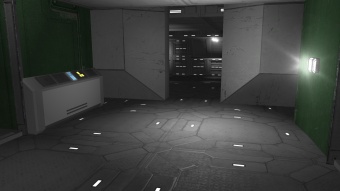
| − | | | + | |[[File:ButtonPanel17.jpg|none|thumb|340px|The button panel on the left controls the door in front]] |
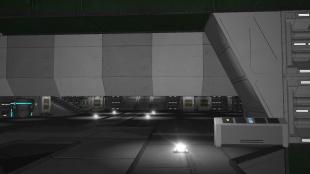
| − | [[File:ButtonPanel17.jpg|none|thumb|340px|The button panel on the left controls the door in front]] | + | |[[File:ButtonPanel18.jpg|none|thumb|310px|The button panel on the right opens this large hanger door behind it]] |
| − | | | + | |- |
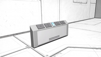
| − | [[File:ButtonPanel18.jpg|none|thumb|310px|The button panel on the right opens this large hanger door behind it]] | + | |[[File:ButtonPanel00.jpg|right|thumb|340px|View of the large button panel]] |
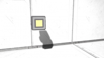
| − | | | + | |[[File:ButtonPanel03.jpg|right|thumb|340px|View of the small button panel]] |
|} | |} | ||
| + | |||
| + | == Tips == | ||
| + | |||
| + | == Known Issues == | ||
== Programming == | == Programming == | ||
| Line 203: | Line 142: | ||
Properties: 0 | Properties: 0 | ||
| − | [ | + | == Update History == |
| + | <div style="-webkit-border-image: none;-webkit-box-shadow: rgba(0, 0, 0, 0.046875) 0px 1px 1px 0px inset;background-color: #eeeeee;border-bottom-color: #AFAFAF;border-bottom-left-radius: 3px;border-bottom-right-radius: 3px;border-bottom-style: solid;border-bottom-width: 1px;border-left-color: #AFAFAF;border-left-style: solid;border-left-width: 1px;border-right-color: #AFAFAF;border-right-style: solid;border-right-width: 1px;border-top-color: #AFAFAF;border-top-left-radius: 3px;border-top-right-radius: 3px;border-top-style: solid;border-top-width: 1px;box-shadow: rgba(0, 0, 0, 0.046875) 0px 1px 1px 0px inset;color: #333;display: block;font-family: 'Helvetica Neue', Helvetica, Arial, sans-serif;font-size: 1em;height: auto;line-height: 20px;margin-bottom: 5px;margin-left: 8px;margin-right: 8px;margin-top: 0px;min-height: 20px;padding-bottom: 4px;padding-left: 4px;padding-right: 4px;padding-top: 4px;width: auto;"> | ||
| + | {| class="wikitable" style="width: 100%" | ||
| + | |style="text-align: left;width: 8%"| [[Update 01.043]] ||style="padding-left: 10px;padding-right: 10px;"| | ||
| + | *Button panel block introduced | ||
| + | |} | ||
| + | |||
| + | </div> | ||
Revision as of 21:18, 18 July 2015
20
Mass (kg):
0
Integrity:
0
Build time (seconds):
10
Dimensions (W x H x D):
1 x 1 x 1
Mass (kg):
0
Integrity:
0
Build time (seconds):
10
Dimensions (W x H x D):
1 x 1 x 1
Contents
Overview
The button panel is self explanatory in that it allows the player to program 4 different buttons on the block. Currently, the buttons may only control devices connected to the grid. In other words, it may not control ships/stations not directly connected to its own grid. However, the small ship version only has one button that may be programmed.
- Note * The button panel must be powered in order to function!
Usage
Light Indicators
| Button Indicator Light Definitions | ||
|---|---|---|
| Color | Status | Comments |
| N / A | Not Programmed | This indicates that the button has not been programmed to do anything |
| Yellow | Is programmed | The button has been programmed, and is ready to be used |
| Red | No Power | There is no power being supplied to it, or it is switched off. |
Control Panel
| Control Panel | |
|---|---|
| Options | Comments |
| Name | You can enter in your own custom name in the text box |
| Show on HUD | If there is an Antenna attached to the same grid, this device will display its position on the players HUD |
| Anyone can use | Anyone (even if they do not own the block) can use the buttons |
| Setup Actions | This takes you to a menu that allow you to program each button on the panel |
The button panel is simple to use, but may appear complicated to a first time user. An example below will explain how to use the block.:
| Example Tutorial | |
|---|---|
|
|
Media
Tips
Known Issues
Programming
(IMyButtonPanel)
Actions: 1
Anyone Can Use On/Off
Properties: 0
Update History
| Update 01.043 |
|


