Difference between revisions of "Button Panel"
(added page, added information, add images, will add icon later) |
Vox Serico (talk | contribs) m (categories) |
||
| (21 intermediate revisions by 8 users not shown) | |||
| Line 1: | Line 1: | ||
| − | {{ | + | {{SimpleItembox|Mod:Vanilla/CubeBlock/ButtonPanelLarge|Size|Mass|Integrity|BuildTimeSeconds|IsAirTight|ResourceSinkGroup|ButtonCount|PCU}} |
| − | | | + | {{SimpleItembox|Mod:Vanilla/CubeBlock/ButtonPanelSmall|Size|Mass|Integrity|BuildTimeSeconds|IsAirTight|ResourceSinkGroup|ButtonCount|PCU}} |
| − | | | + | {{CategorizeComponents|Mod:Vanilla/CubeBlock/ButtonPanelLarge}} |
| − | + | == Overview == | |
| − | + | The button panel is self explanatory in that it allows the player to program 4 different buttons on the block. Currently, the buttons may only control devices connected to the grid. In other words, it may not control ships/stations not directly connected to its own grid. However, the '''small ship version only has one button''' that may be programmed. | |
| − | + | ;Note * The button panel must be powered in order to function! | |
| − | + | ||
| − | + | == Usage == | |
| − | + | The button panel can be used to trigger [[Door]]s, depressurize [[Air Vent]]s, or simply switching a whole group of [[Interior Light]]s. The number of possibilities are up to the player. The buttons 1-4 are from left to right. The player can use the [[Controls#Systems_1|Interact]] button and a list of all available controllable blocks on the grid will be displayed. | |
| + | |||
| + | For it to function, the button panel requires power at all times. So in a situation where no power is being supplied, the player has to manually input commands in the control panel to any blocks. | ||
| + | |||
| + | === Control Panel === | ||
| + | |||
| + | * '''Name''' - You can enter in your own custom name in the text box | ||
| + | * '''Show on HUD''' - If there is an [[Antenna]] attached to the same grid, this device will display its position on the players HUD | ||
| + | * '''Anyone can use''' - Anyone (even if they do not own the block) can use the buttons | ||
| + | * '''Setup Actions''' - This takes you to a menu that allow you to program each button on the panel | ||
| − | | | + | === Light Indicators === |
| − | | | + | {| class="wikitable" |
| − | | | + | |[[File:Landing_Gear_GYsquare.jpg|none|30px]] |
| − | | | + | |style="text-align:center;"|Not Programmed |
| − | | | + | |This indicates that the button has not been programmed to do anything |
| − | | | + | |- |
| − | | | + | |[[File:Air_Vent_Front_Indicator_Yellow.png|none|30px]] |
| − | | | + | |style="text-align:center;"|Is programmed |
| − | | | + | |The button has been programmed, and is ready to be used |
| − | | | + | |- |
| + | |[[File:Air_Vent_Front_Indicator_Red.png|none|30px]] | ||
| + | |style="text-align:center;"|No Power | ||
| + | |There is no power being supplied to it, or it is switched off. | ||
| + | |- | ||
| + | |} | ||
| − | + | === Example === | |
| − | |||
| − | |||
| − | |||
| − | |||
| − | |||
| − | |||
| − | |||
| − | |||
| − | |||
| − | |||
| − | |||
| − | |||
| − | |||
| − | |||
| − | |||
| − | |||
| − | |||
The button panel is simple to use, but may appear complicated to a first time user. An example below will explain how to use the block.: | The button panel is simple to use, but may appear complicated to a first time user. An example below will explain how to use the block.: | ||
| − | {| | + | {| class="wikitable" |
| − | | | + | !colspan="2" style="text-align:center;" | Example Tutorial |
| − | + | |- | |
| + | |style="width: 530px;" | <ol> | ||
| + | <li value="1">In this example, we have 4 light blocks on the wall: Red, Green, Blue, Yellow | ||
:[[File:ButtonPanel04.jpg|none|thumb|175px]] | :[[File:ButtonPanel04.jpg|none|thumb|175px]] | ||
| − | + | <li value="2">Now, placed in front of them is the button panel block. It has not yet been programmed, and does not show any indicator lights on it. | |
:[[File:ButtonPanel05.jpg|none|thumb|175px]] | :[[File:ButtonPanel05.jpg|none|thumb|175px]] | ||
| − | + | <li value="3">We will now assign each button to each light on the wall in front of it. As we walk up to the panel, we will highlight one of the buttons (In this case, the first one with one square), and press the open control panel button (default "K"). | |
:[[File:ButtonPanel07.jpg|none|thumb|175px]] | :[[File:ButtonPanel07.jpg|none|thumb|175px]] | ||
| − | + | <li value="4">This menu shows all the devices that your button panel can control. You may see multiple images of the same device. Each devices name will show up by simply hovering your mouse over them. | |
:[[File:ButtonPanel08.jpg|none|thumb|175px]] | :[[File:ButtonPanel08.jpg|none|thumb|175px]] | ||
| − | + | <li value="5">If you hover your mouse over a device, you can right-click for all its options. The button may control any one of these actions. In this example we will give the button the "Toggle block On/Off". Simply select this option. | |
:[[File:ButtonPanel09.jpg|none|thumb|175px]] | :[[File:ButtonPanel09.jpg|none|thumb|175px]] | ||
| − | + | <li value="6">Notice on the bottom of the screen the light block action we selected has been placed there. In this case, it is the button with 1 square on the left. You can click each button on the bottom of the screen, and assign it a command. Now we will select the button with 2 squares (on the left) to give the next button a new command. | |
:[[File:ButtonPanel10.jpg|none|thumb|175px]] | :[[File:ButtonPanel10.jpg|none|thumb|175px]] | ||
| − | + | </ol> | |
| + | |style="width: 530px;" | <ol> | ||
| + | <li value="7">Like before, we will right click on the next light block and assign the action "Toggle block On/Off". Notice that is now also is placed on the bottom of the screen. We will repeat this until all four light blocks have each their own button. | ||
:[[File:ButtonPanel11.jpg|none|thumb|175px]] | :[[File:ButtonPanel11.jpg|none|thumb|175px]] | ||
| − | + | <li value="8">After we are finished, exit the interface. You will notice that the buttons on the panel are now lit up (yellow). This indicates the button has something assigned to it and is ready to be used. | |
:[[File:ButtonPanel12.jpg|none|thumb|175px]] | :[[File:ButtonPanel12.jpg|none|thumb|175px]] | ||
| − | + | <li value="9">Lets try out our new assigned buttons. We'll first use the action button on the far left one (1 square) to turn off the red light. Notice it will instantly turn off once you press the button. | |
:[[File:ButtonPanel13.jpg|none|thumb|175px]] | :[[File:ButtonPanel13.jpg|none|thumb|175px]] | ||
| − | + | <li value="10">Next, we'll shut off (blue) with button number 3 (3 squares). | |
:[[File:ButtonPanel14.jpg|none|thumb|175px]] | :[[File:ButtonPanel14.jpg|none|thumb|175px]] | ||
| − | + | <li value="11>Now we will switch off the rest | |
:[[File:ButtonPanel15.jpg|none|thumb|175px]] | :[[File:ButtonPanel15.jpg|none|thumb|175px]] | ||
| − | + | <li value="12">To turn back on the light, simply press the button again. | |
:[[File:ButtonPanel16.jpg|none|thumb|175px]] | :[[File:ButtonPanel16.jpg|none|thumb|175px]] | ||
| − | | | + | </ol> |
| + | |} | ||
| + | |||
| + | <!-- Add more advanced features of the control panel with the grouping system--> | ||
| + | |||
| + | == Media == | ||
| + | {| class="wikitable" | ||
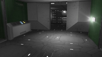
| + | |[[File:ButtonPanel17.jpg|center|thumb|340px|The button panel on the left controls the door in front]] | ||
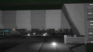
| + | |[[File:ButtonPanel18.jpg|center|thumb|310px|The button panel on the right opens this large hanger door behind it]] | ||
| + | |- | ||
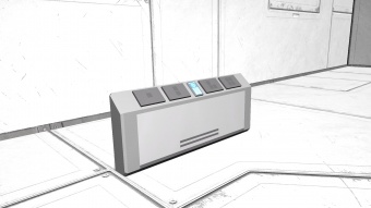
| + | |[[File:ButtonPanel00.jpg|center|thumb|340px|View of the large button panel]] | ||
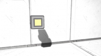
| + | |[[File:ButtonPanel03.jpg|center|thumb|340px|View of the small button panel]] | ||
|} | |} | ||
| + | == Tips == | ||
| + | * If you're wanting to instead make button #4 activate a door, instead of #1 on the panel but don't want anything inbetween, here is a very simple trick. Go into "setup actions" in the button panel, and just add 3 random triggers. For example, switch off 3 different lights. For the #4 button, set the action you want it too. Now delete the previous 3 triggers (buttons #1-3). Done! | ||
| + | |||
| + | == Known Issues == | ||
| + | == Programming == | ||
| + | * [[Programming_Guide/Action_List#Button_Panel|Action List - Button Panel]] | ||
| − | == | + | == Update History == |
| − | {| | + | <div style="-webkit-border-image: none;-webkit-box-shadow: rgba(0, 0, 0, 0.046875) 0px 1px 1px 0px inset;background-color: #eeeeee;border-bottom-color: #AFAFAF;border-bottom-left-radius: 3px;border-bottom-right-radius: 3px;border-bottom-style: solid;border-bottom-width: 1px;border-left-color: #AFAFAF;border-left-style: solid;border-left-width: 1px;border-right-color: #AFAFAF;border-right-style: solid;border-right-width: 1px;border-top-color: #AFAFAF;border-top-left-radius: 3px;border-top-right-radius: 3px;border-top-style: solid;border-top-width: 1px;box-shadow: rgba(0, 0, 0, 0.046875) 0px 1px 1px 0px inset;color: #333;display: block;font-family: 'Helvetica Neue', Helvetica, Arial, sans-serif;font-size: 1em;height: auto;line-height: 20px;margin-bottom: 5px;margin-left: 8px;margin-right: 8px;margin-top: 0px;min-height: 20px;padding-bottom: 4px;padding-left: 4px;padding-right: 4px;padding-top: 4px;width: auto;"> |
| − | | | + | {| class="wikitable" style="width: 100%" |
| − | + | |style="text-align: left;width: 8%"| [[Update 01.043]] ||style="padding-left: 10px;padding-right: 10px;"| | |
| − | | | + | *Button panel block introduced |
| − | [[ | ||
| − | |||
|} | |} | ||
| + | |||
| + | </div> | ||
| + | [[Category:Miscellaneous Blocks]] | ||
| + | [[Category:Functional_Blocks]] | ||
Latest revision as of 22:43, 18 May 2020
194,000,000 mg
0.194 t
22,200,000 mg
0.0222 t
Contents
Overview
The button panel is self explanatory in that it allows the player to program 4 different buttons on the block. Currently, the buttons may only control devices connected to the grid. In other words, it may not control ships/stations not directly connected to its own grid. However, the small ship version only has one button that may be programmed.
- Note * The button panel must be powered in order to function!
Usage
The button panel can be used to trigger Doors, depressurize Air Vents, or simply switching a whole group of Interior Lights. The number of possibilities are up to the player. The buttons 1-4 are from left to right. The player can use the Interact button and a list of all available controllable blocks on the grid will be displayed.
For it to function, the button panel requires power at all times. So in a situation where no power is being supplied, the player has to manually input commands in the control panel to any blocks.
Control Panel
- Name - You can enter in your own custom name in the text box
- Show on HUD - If there is an Antenna attached to the same grid, this device will display its position on the players HUD
- Anyone can use - Anyone (even if they do not own the block) can use the buttons
- Setup Actions - This takes you to a menu that allow you to program each button on the panel
Light Indicators
| Not Programmed | This indicates that the button has not been programmed to do anything | |
| Is programmed | The button has been programmed, and is ready to be used | |
| No Power | There is no power being supplied to it, or it is switched off. |
Example
The button panel is simple to use, but may appear complicated to a first time user. An example below will explain how to use the block.:
| Example Tutorial | |
|---|---|
|
|
Media
Tips
- If you're wanting to instead make button #4 activate a door, instead of #1 on the panel but don't want anything inbetween, here is a very simple trick. Go into "setup actions" in the button panel, and just add 3 random triggers. For example, switch off 3 different lights. For the #4 button, set the action you want it too. Now delete the previous 3 triggers (buttons #1-3). Done!
Known Issues
Programming
Update History
| Update 01.043 |
|


